Welcome
To Melon's Island, the site that is all about my old but renewed story called Melon's Adventures.This story is about a bird named Melon that is given electric powers to fight off evil from a mysterious bird called 'The Goddess Creature'. Melon goes on a quest, along with the creature to fight evil and to find out what happened to the rest of her species that suddenly disappeared. Filled with a lot of adventures and action scenes, as Melon faces many villains along her quest, and wants answers on what happened to the other Tropical Birds.
New and old visitors are always welcome! :D
Please sign the Guest Book, I love hearing your comments! ^-^
About This Layout
Update Avatar
Splash Image Font: Matisse ITC
Banner Font: Matisse ITC
Header Font: Matisse ITC
Programs Used: Gimp, Paint.NET &
Adobe Photoshop Elements 7
Images - Traditional Stage
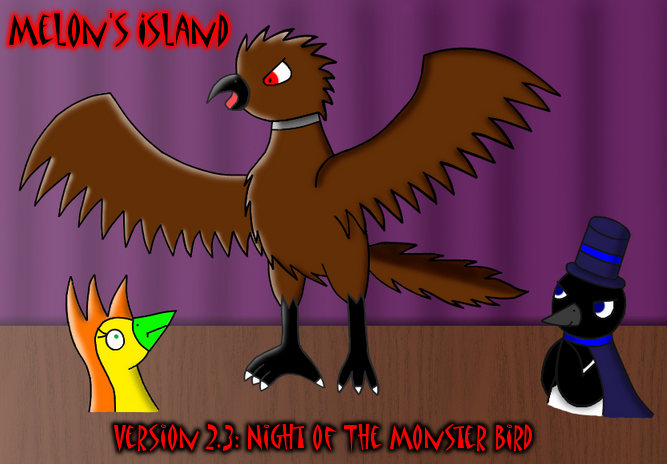
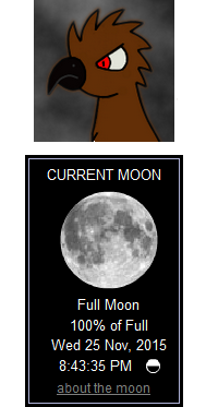
First it started with small ideas in a very secret page of Melon's Island; Notes and then with a lot of ideas written down on a small sheet of paper that I use for writing notes. I began the long Version 2.3 project on 9/13 which was when I drew the first Current Moon Phase image of Aaron, then tried to draw his Monster Forum but failed at it, that is until I tried it again the next day and got a decent image. I then drew Aaron transforming for the splash image on the same day. For the banner image, I made a quick sketch of it on my wipe off board on 9/17 and used it as a reference for the real thing; which I worked on 9/19 - 20. I didn't plain for Aaron in his Monster form to have more than 7 strands of feathers sticking out from his head (like the first image of him) but I really had trouble drawing him, including the front view of his right foot.
Images - Digital Stage
Since I didn't want to line art with an ink pen, yet again I chose the hard way; line art the drawings in Paint.Net with the move-able line tool, which didn't seem hard at first but with the Current Moon Phase images, the splash image, and the banner it was so much trouble that I regretted on using the ink pen. In Adobe Photoshop Elements 7, I ended up having to use the multiply option in layers while combining the colored and line art version of the Current Moon Phases images and the splash image which made Aaron's CMP image dark despite most of his colors being bright but multiply was the best option since I couldn't use normal when adding a layer on top of another so it dimmed the light colors though the green for Aaron's feet on the splash image came out better.. Then I decided to color the banner before line arting it than the other way around with all the other images though it became more of a issue to make sure the original lines didn't stick out underneath the digital lines which appeared in many little white/light colored dots that surrounded most of the lines. Shading the characters wasn't so hard and I didn't even bother to shade the CMP images but highlighting the banner and the splash as well became a must once I added the full moon image to the left side of the layout and added a white and transparent gradient to make it seem like that full moon was shining it's light on the banner. For the background of both the banner and the splash, I tried creating the stage that Set held his magic show at by adding lines of shading to make it look like curtains on the purple part and downloaded a pack of wood brushes but only used one, for the ground part of the stage.
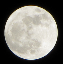
The Layout
For the layout, I did a lot of editing since I was using Version 8 of Legendary Birds which is one of my sites. I wanted the colors to be that of a Monster Bird so I did but red and black is more of a Canaku thing but the vision of those monsters consents of only red and black so that's the reason. Why I picked grey colored links is because of Aaron's collar being grey. For the background, I thought of using this image at first but wanted to use the background image from the Current Moon Phase Page once I looked at that page once more and decided to use it but angled it to the right side of the layout. Which then led up to having the full moon image on the left side of the layout but resized it to be able to fit. I chose these two images for the background so I could make a night sky as when Set's magic show took place except clouds where involved in the chapter.. oh well. Once I added the banner to this layout I didn't want to resize it anymore so that's why the right side is sticking out. And aligned the Current Moon Phase module so that it would be bigger in height than in width, like it used to be in the previous layout. Since I have red link back buttons for all of my other sites (except for Penguin HQ) I used them to fit in with the redness :D


